Iconography is a lost art. Illustration is super time-consuming, and there’s an abundance of resources out there already. So it’s not always worth reinventing the wheel. But we may need a specific art style, or the icon framework we’re using may not have the icon we want, so it’s worth diving into how illustration works in Figma a little bit. In this tutorial, we’ll learn how to draw and manipulate vectors in Figma as we create a heart-shaped icon to accompany the button.
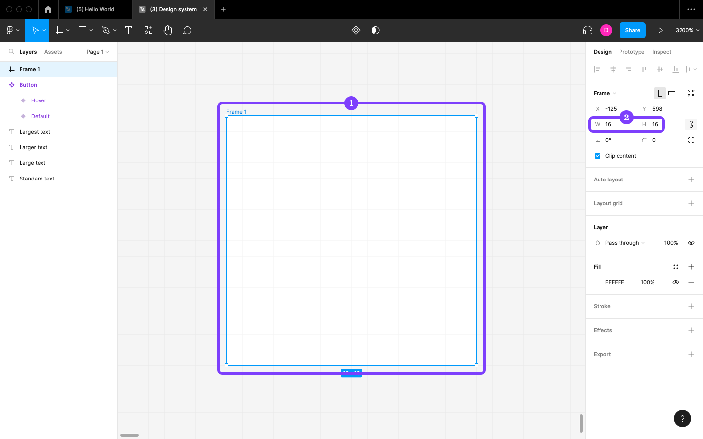
Start by creating a 16×16 Frame, which will be the bounding box for our icon. Paul Wilshaw explains why it’s best to use 16×16 in his write-up on icon design.
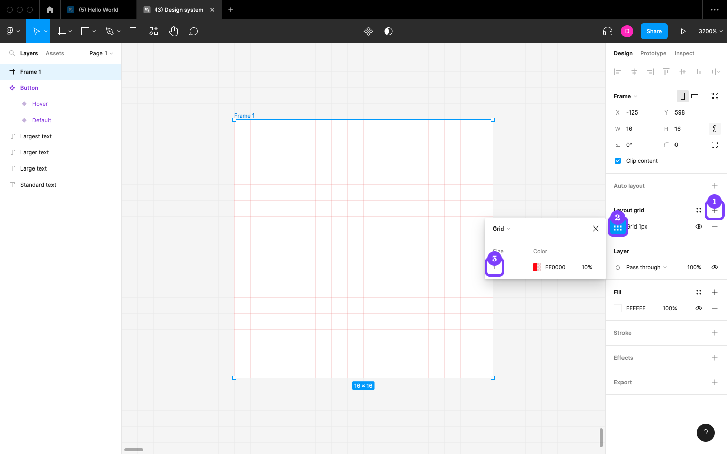
Next, click on the + icon next to “Layout grid” in the Design panel to add a Grid to the Frame, click on the “Layout grid settings” icon, and then change the “Size” to 1 to make the individual square pixels clearer. To ensure the icon displays clearly at most sizes and screen resolutions, the objective will be to align the icon with the grid lines as much as possible.
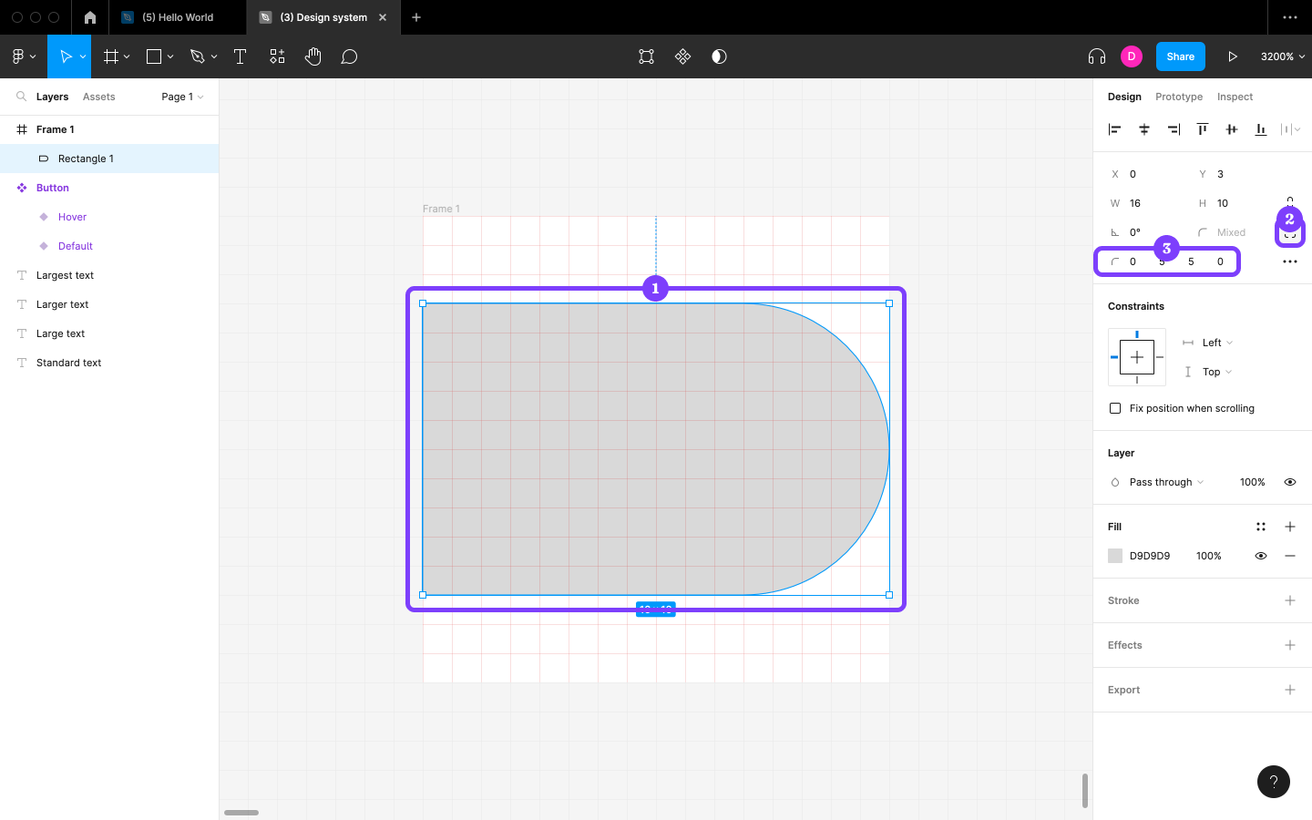
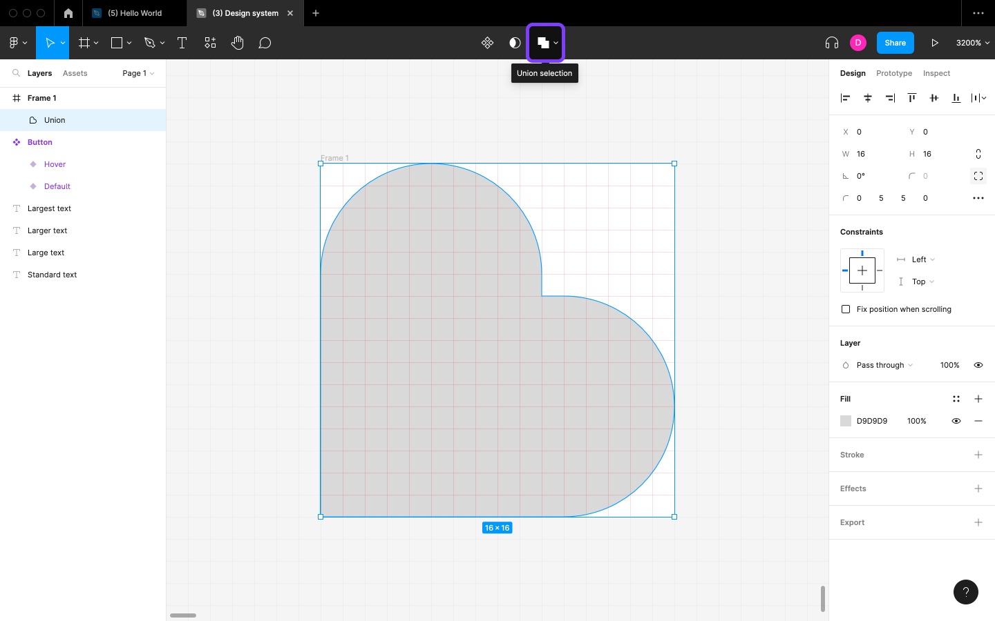
Now for the icon itself. Start by creating a Rectangle shape and specifying the “W” as 16 and “H” as 10, and then click on the “Independent corners” icon before specifying the corner radii as 0, 5, 5, and 0 in that order (that is, clockwise starting from the top-left corner).
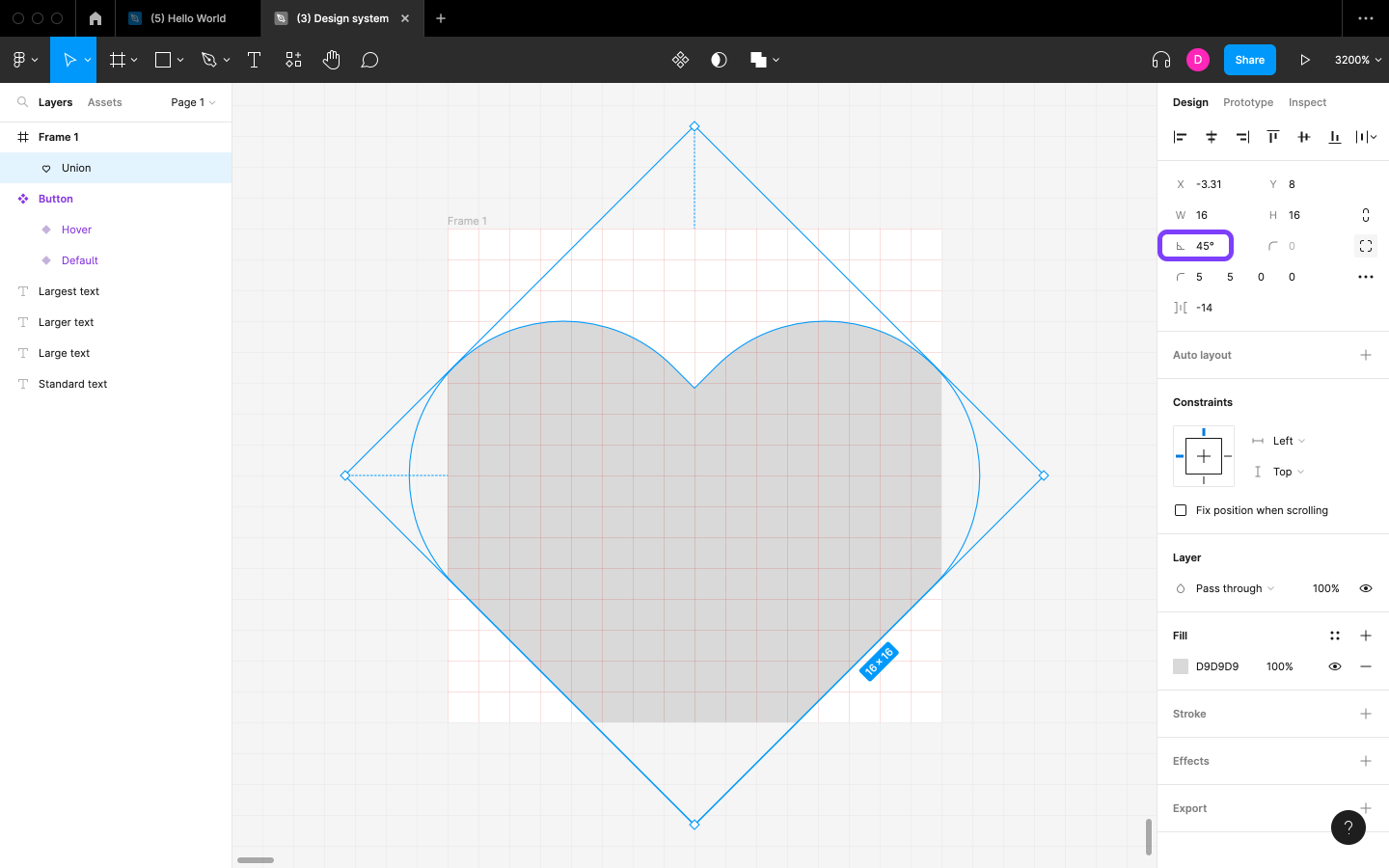
Next, duplicate the Layer and change the “Rotation” to 90.
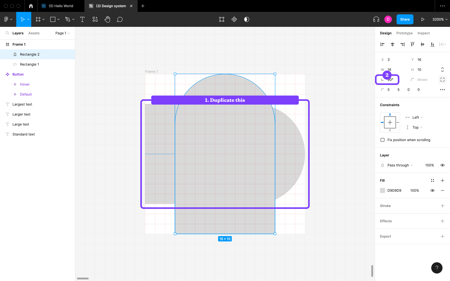
After that, snap the Layer to the left edge of the Frame and the other Layer to the bottom edge of the Frame, and then, with both Layers selected, click on the “Union selection” icon in the horizontal toolbar to fuse the Layers into a single Layer.
Change the “Rotation” to 45—and that’s the heart shape done.
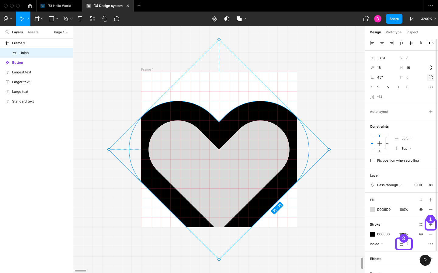
Before we make the heart shape fit into the Frame, add a Stroke (border) by clicking on the + icon next to “Stroke” in the Design panel, choosing 2 for the “Stroke width”. Later on, this will offer us the opportunity to use outlined icons as well as filled icons.
The post Creating a Custom Button Icon in Figma appeared first on SitePoint.